
Fletcher H. Maffett
Brand Senior Art Director and Creative Director

Bus shelter poster designs for Bowie State University
Summer 2023

BRIEF
(Verbatim from the client)
This is a Bus Shelter for Bowie State University.
Assets, style guide and photos are attached. The Style Guide showcases their previous work (See samples on page PG 28 of the Style Guide).
They are looking to go “BOLDER” with their brand. They want the 2.0 campaign to look different from what they currently have. Feel free to explore.
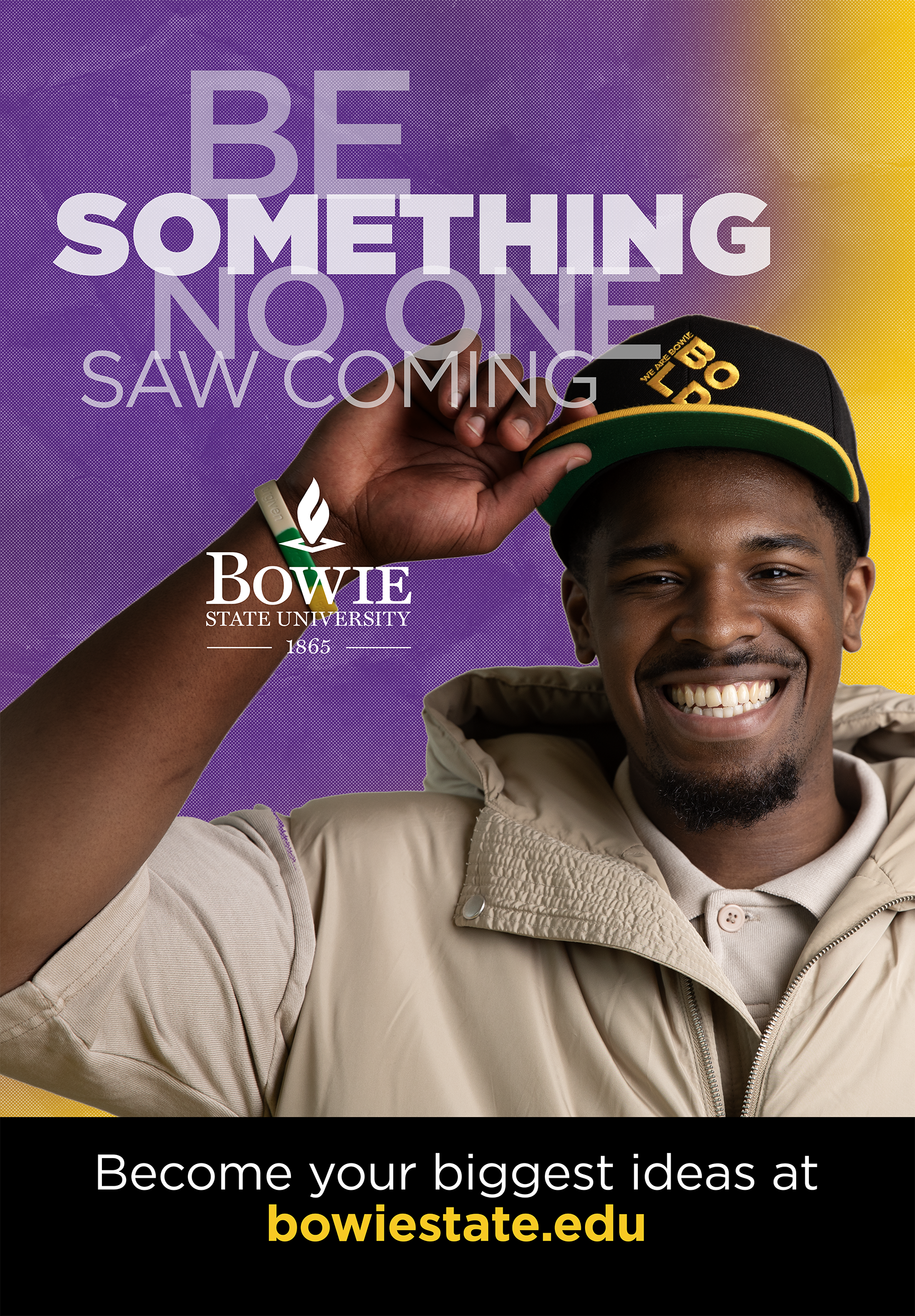
HEADLINE: Be something no one saw coming.
CTA: Become your biggest ideas at bowiestate.edu
SPECS: 47.5”W x 68.5H”
BLEED: .25” all around
All supplied materials are found below.
Solution
I had not worked with this client before and was unfamiliar with their brand standards. BSU had sent me their brand guidelines and while it looked pretty good to me, I suspected their current standards were becoming stale and they were looking for a fresh take on their brand’s design style.
After reviewing the print samples of page 28 from their brand guidelines as requested, all I saw was a lot of yellow and black mixed with color or black and white photography.
Also, how old—or how recent are the samples on page 28? Those designs are clean, contemporary and are very well done. I can only assume that since they are looking for something new, the existing work must seem stale to BSU. In accordance to the brief, my design solutions will be in part evolution and/or revolution.
Since I am asked to go bolder with the design approach, my solution will be to integrate more of the colors found in their brand color standards and take a bolder approach on their typographic usage. That choice proved to be the correct one!
Supplied Creative Brief materials

Model 1.

The color standards to be used for all BSU collateral.

Model 2.

All brand standard acceptable logo applications.

These are the “page 28” print samples I was asked to reference from the brief.
The value of doing your research
What I discovered from their brand standards/style guide was a treasure trove of marketing photographs in and around the BSU campus. I loved them. They are rich with color and they reflect much of what is used throughout their brand color palette, albeit from the samples used on page 28 of their Style Guide.
These images would fuel my conceptual design color palette for these bus shelter designs. As quoted from the Creative Brief, “Feel free to explore.”

First round design concepts

Concept 1A

Concept 1B

Concept 2A
Concept 2B

Concept 3A

Concept 3B


The final concept
In Concepts 1 – 3, there were elements in each that I liked—however, using any of those concepts as separate designs just wasn’t working for me.
I decided to use the duotone approach from Concept 3, the asymmetric copy styling from Concept 2, and the architecture of the design in Concept 1 as a separately new concept—which would ultimately be the final design.
The use of color and the portrait shots were intended to be the eye-grabber. But what I wanted to be read from a distance was the message…BE SOMETHING. My goal was to use that as a motivator that the reader as something they could identify with.
It was exactly what they were looking for.


The image at the top of this case study is a comp I designed to show both final concepts to the client for review—but separately. Meaning, I didn’t want to present both concepts side-by-side. With this comp, I could present something that was completely believable for each poster.
The purple ad at right is the other environmental signage study I submitted as a part of my client presentation—knowing they would ask to see it.
It’s a completely artificial image comprised of an isolated photo of a “dude” walking, and a mock-up photo of two posters in a staged environment, side-by-side.


The other ad is for a non-existent company, Berkshire Mens Clothiers (since 1947!), which I completely made up to show how another ad might live beside BSU’s poster for a color/composition comparison test.
