
Fletcher H. Maffett
Brand Senior Art Director and Creative Director

Brand design and identity development
Winter 2022
Brief
Helios is a new capital management firm located in Bethesda, Maryland, on the northwest border of Washington, D.C. Their business is venture capital real estate investment properties in Virginia, Maryland, and the District of Columbia.
The firm was looking for a brand identity and had no perceived creative ideas in mind except that they wanted to use the name of a Greek or Roman mythological God—but most were either trite or overused. Along with a new identity, they wanted a stationery package consisting of a letterhead and business card as well as a presentation, monthly summary, and a website.
Solution
I did my research and discovered that “Helios” was one of the least commonly used names in the financial industry so I proposed Helios with some logo options.
(Helios was the Greek Titan God of the Sun, a guardian of oaths, and the God of sight.)
With an approved logo, I was able to finalize the requested products. The work period for this entire project was from late April – June, 2022.
The design Study process
You have to start somewhere.
A second look at an original design solution…
The final logo design
Color system

Design system

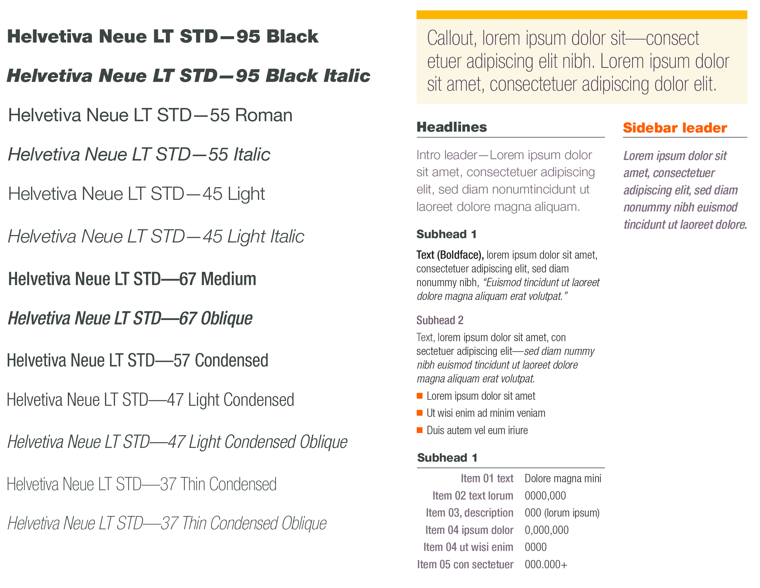
Typography
Stationery package
8.5”W x 11”H stationery
Business card front
Business card back.
Monthly reports
Presentations

I designed and produced The above work for HELIOS as the Creative Director for Alpha Lab Creative.


Download our marketing communications best practices for financial investors brochure.