February 2014 — November 2015
(Onsite Aquent Creative Partners Contractor)
DIRECT MARKETING FOR PRINT & DIGITAL | MARKETING COMMUNICATIONS DESIGN | CAPITAL ONE BANK’S INTERNAL AD AGENCY
Capital One
A direct response rebrand—
Repositioning a misunderstood brand and stabilizing a team in disarray.
The context
Capital One had just acquired nearly a dozen regional banks—each with its own branding, account structure, and loyal customer base. I was assigned as a Senior Art Director to work on and design the largest direct marketing effort in Capital One’s history, a retention and conversion campaign called Complex Wave, designed to bring those inherited customers into the Capital One fold. Internal projections estimated we might retain only 30–40% of those customers.
The crisis
Two weeks into Complex Wave, our Creative Director exited and we were without leadership. Strategy teams took over, revisions spiraled, and morale collapsed. I was asked to step in as acting Creative Director to reclaim the team’s leadership and the work.
The response
Drawing on my experience in direct response and regulated industries, I rebuilt trust, reestablished process, and directed a cross-functional team. Together, we delivered an integrated campaign across print and digital—on time, under budget, and with renewed confidence.
The result
Under my direction, the team retained retained 87% of customers—more than double the expected retention—and helped shift Capital One’s image from an online credit card company to a brand leader in the commercial banking industry. Read more in the testimonials, below.

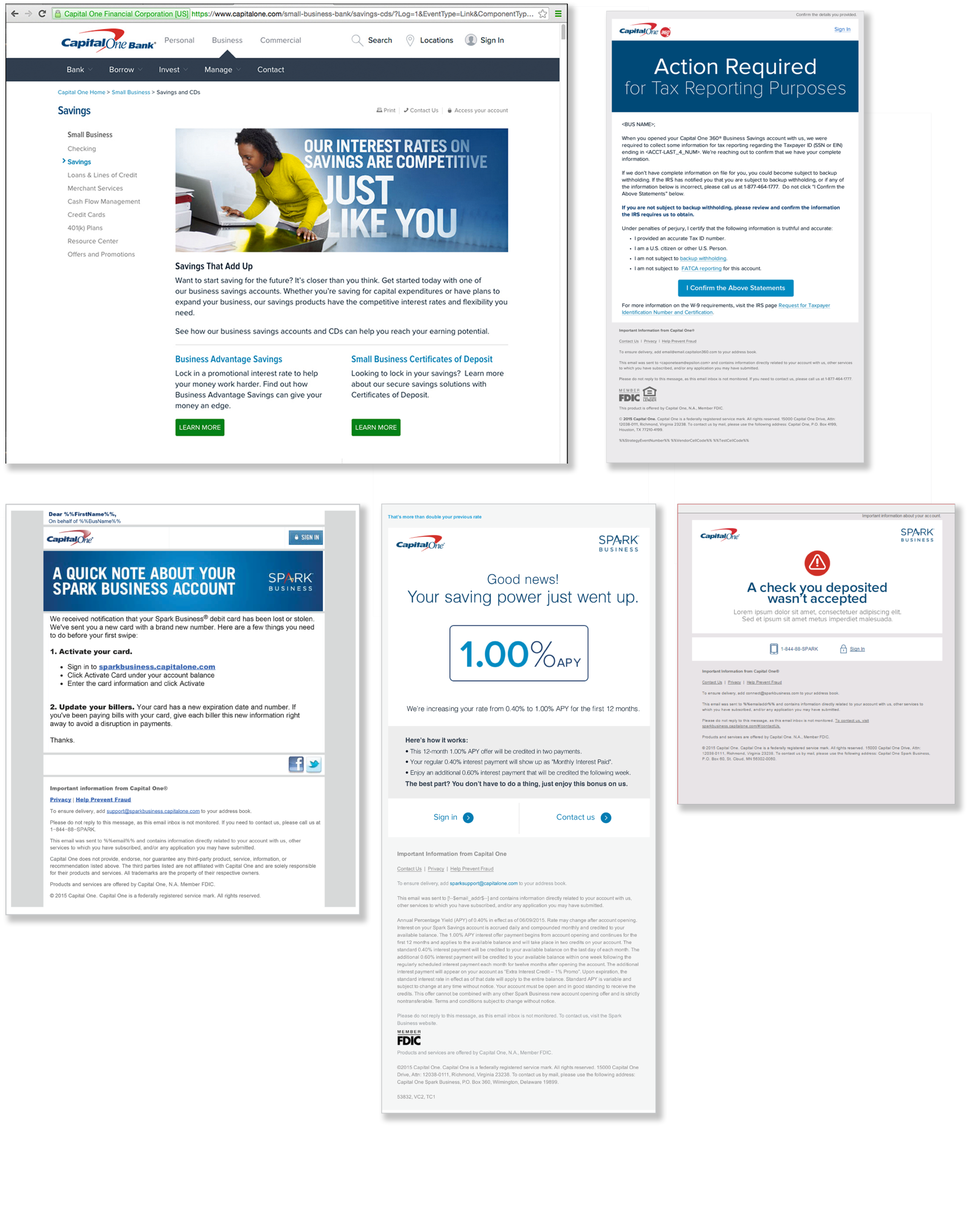
A closer look at the Complex Wave campaign
This campaign ran in four quarterly waves across 2014, combining print and email messaging. Each wave targeted five distinct customer groups with tailored packages—first announcing account changes, then following up to secure missing information. The cadence repeated until every account was transitioned into the Capital One suite of services.
See the entire year-long Complex Wave campaign.
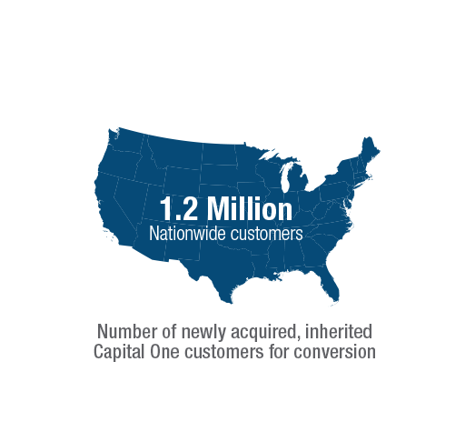
Customer conversion nationwide
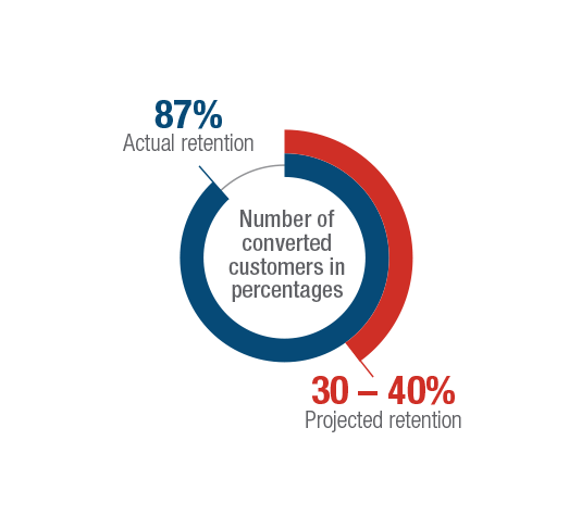
Retention impact
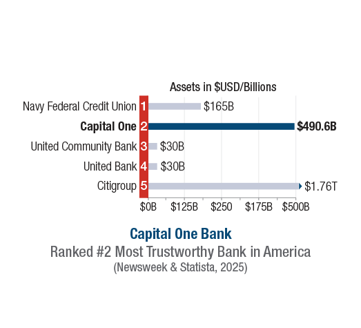
Trust and market strength
Rebranding a leader in the commercial banking industry
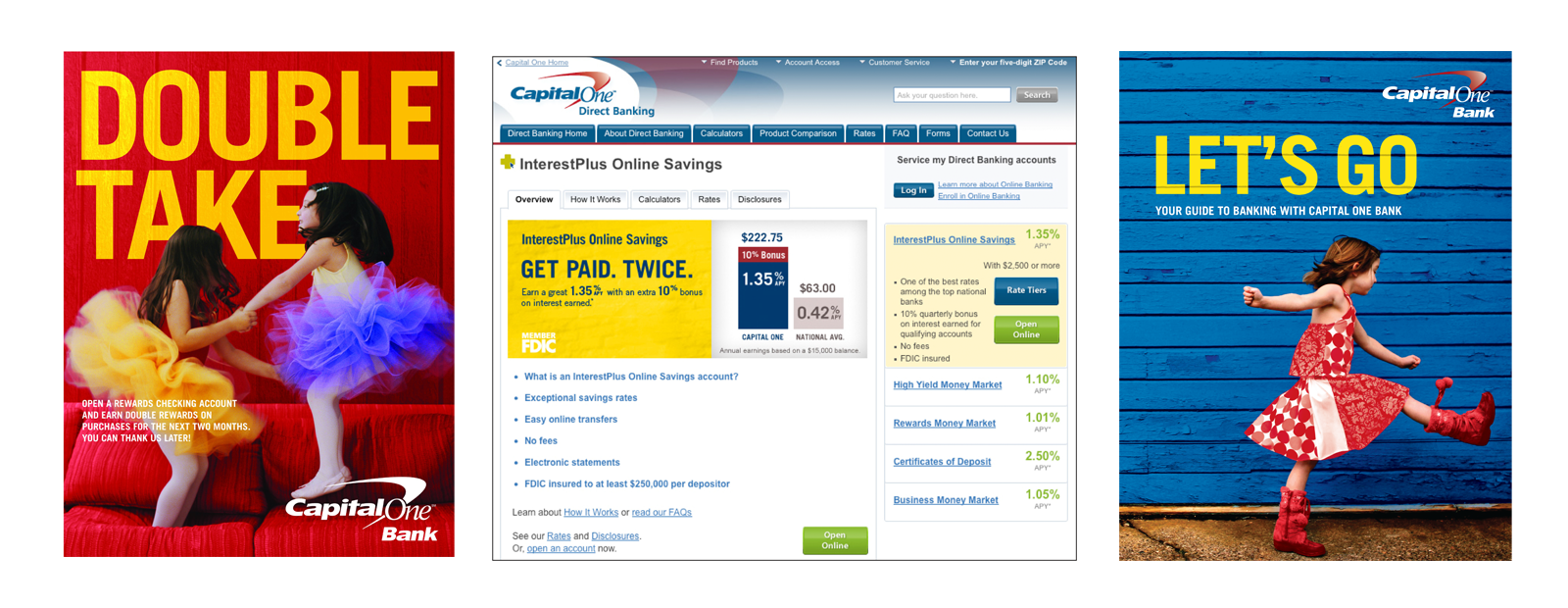
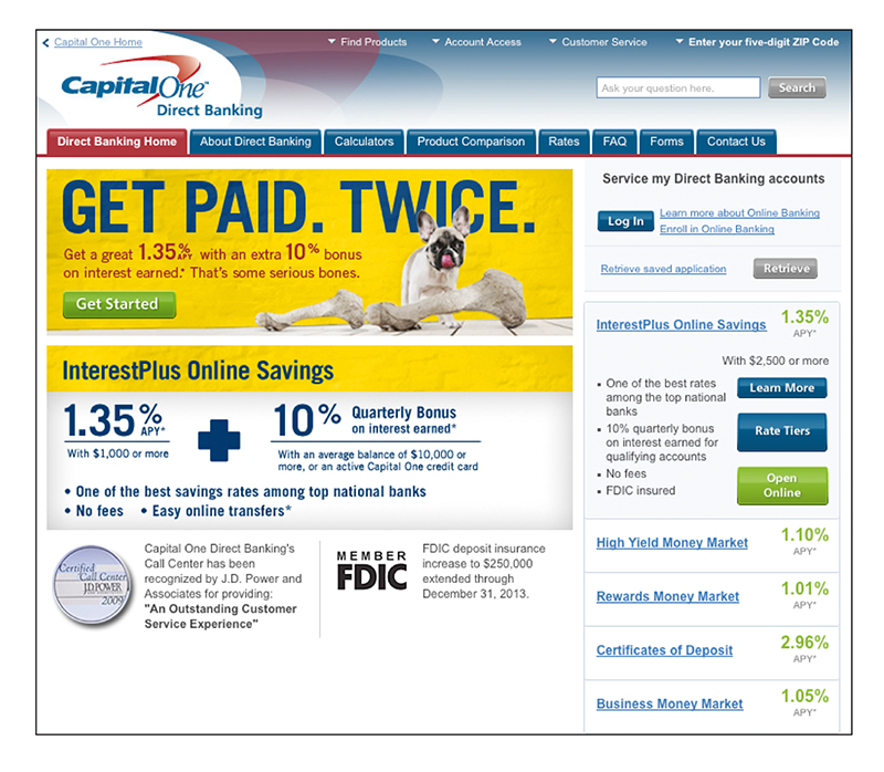
BEFORE
Above and below is the “old” brand identity prior to our arrival as Capital One’s internal advertising agency. The imagery was all “see say” and the loud primary colors were almost too offensive to the reader’s senses—projecting random, punny images and a lot of visual clutter.
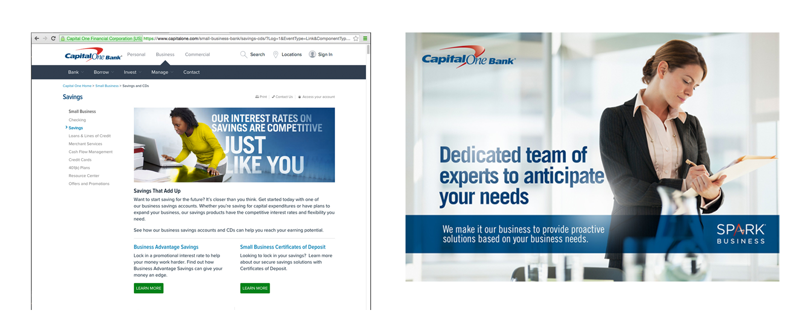

AFTER
Above and below is the fully refreshed brand identity we created to give Capital One a relatable look and feel—not only for the bank, but for the customers throughout all of Capital One—for personal as well as business banking.


Spark Business logos
While at Capital One, I was asked to develop alternate logo designs for Spark Business. I was approached for the assignment because I’d built a reputation as “the logo guy.”
Leadership in my group felt the existing mark looked dated and out of step with Capital One’s brand identity and standards. No one internally could even agree on what the letterform “A” was meant to convey.
I presented two options that captured the motion or suggestion of a spark while using the official Capital One typeface and colors. The top set shows simple logo treatments—old versus new.
The bottom set are lock-ups pairing the Capital One logo with Spark Business identities. I recommended the all-blue Spark mark, believing a two-color version pulled too much attention from Capital One’s logo, which I felt needed to remain dominant.
The Creative Director left before the work could move forward, and the concept was shelved—a shame, because I thought these directions were strong.
“While working under his leadership in the Brand Creative group at Capital One, he taught us to raise the bar across the creative process. He’s a mentor to subordinates and an asset to superiors. A design Jedi, Fletcher’s precision and eye for detail are masterful.”
—MEGAN PATRICK, SENIOR COPYWRITER