
January 2007 — Present
BRAND IDENTITY DESIGN | ADVERTISING AGENCIES | IN-HOUSE CORPORATE COMMUNICATIONS | DIRECT MARKETING (PRINT & DIGITAL) | PHARMA & HEALTHCARE | RETAIL | ON-AIR BROADCAST PROMOTIONS | DATA VISUALIZATION

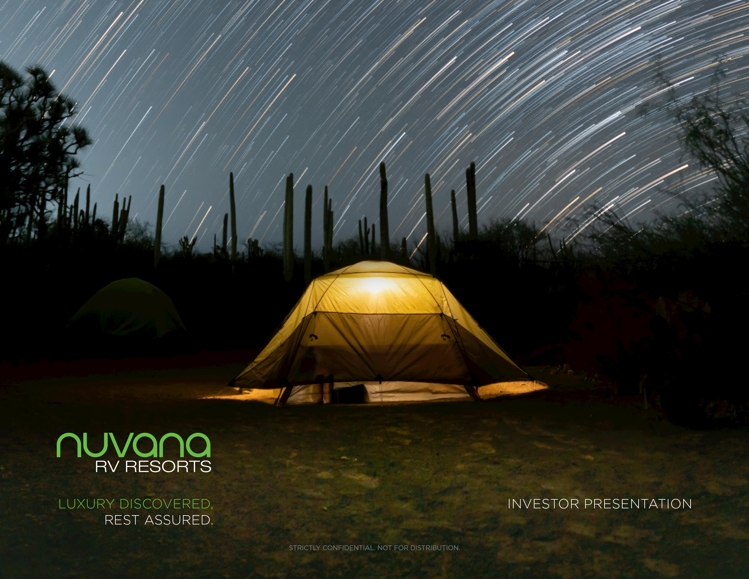
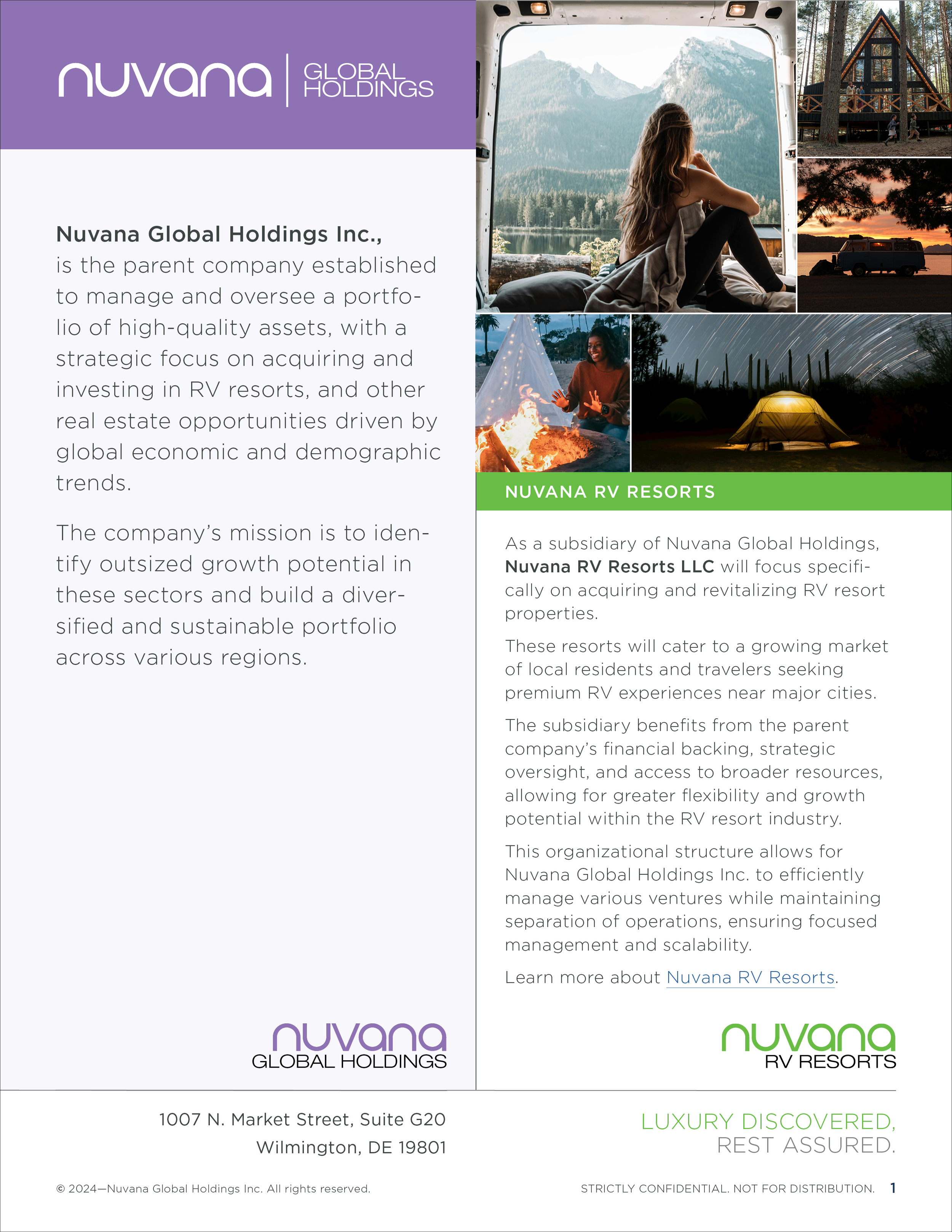
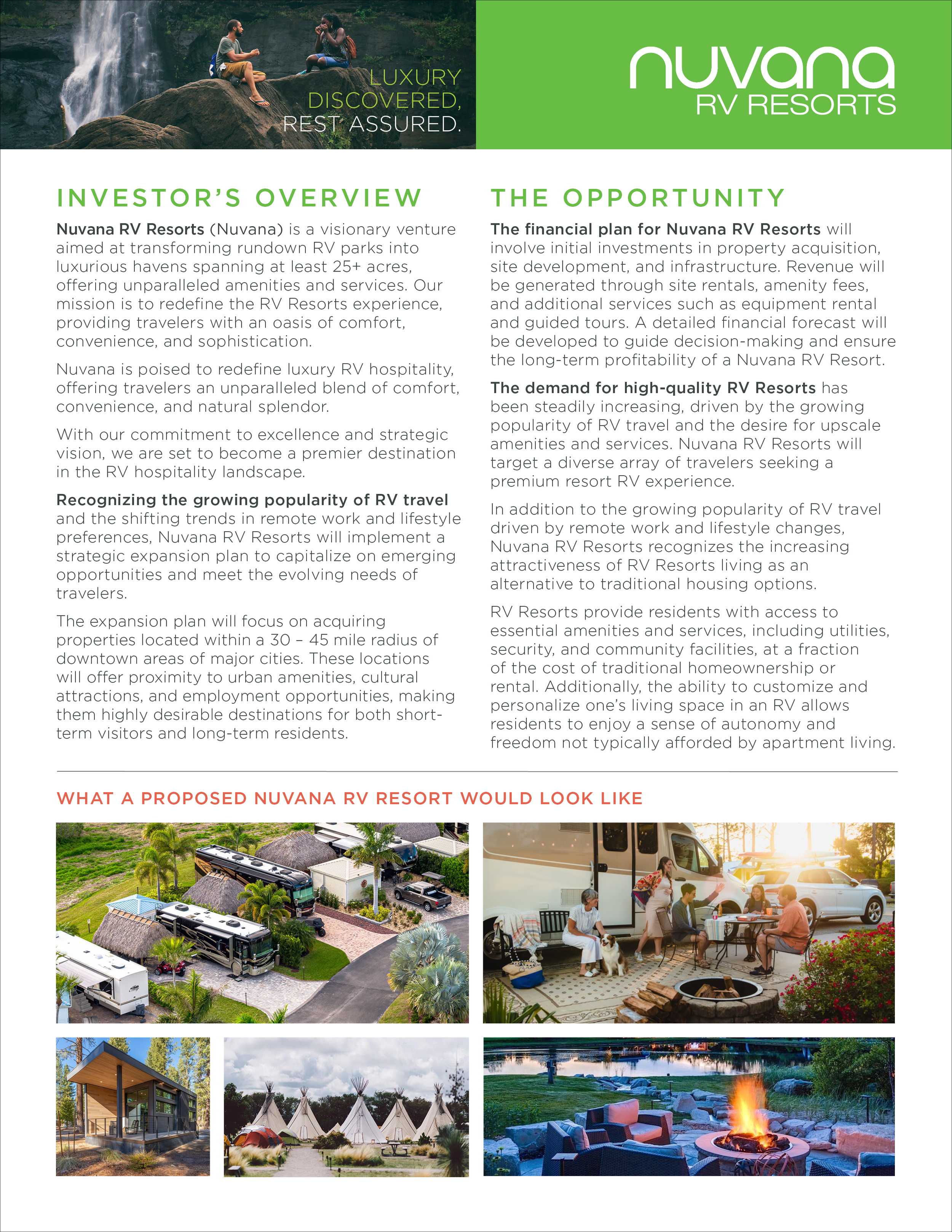
Branding a fast-emerging leader in luxury camping.
Spring – Winter, 2024
With amenities such as health spas, outdoor kitchens, trails, spacious camping sites, and upscale pet facilities—plus outdoor theaters and access to waterways for swimming, boating, and fishing—Nuvana is about to turn the recreational camping industry upside down.
Throughout most of 2024, I created their brand identity, investment marketing materials, and established the brand standards for this soon-to-be national brand—building a foundation for rapid expansion.

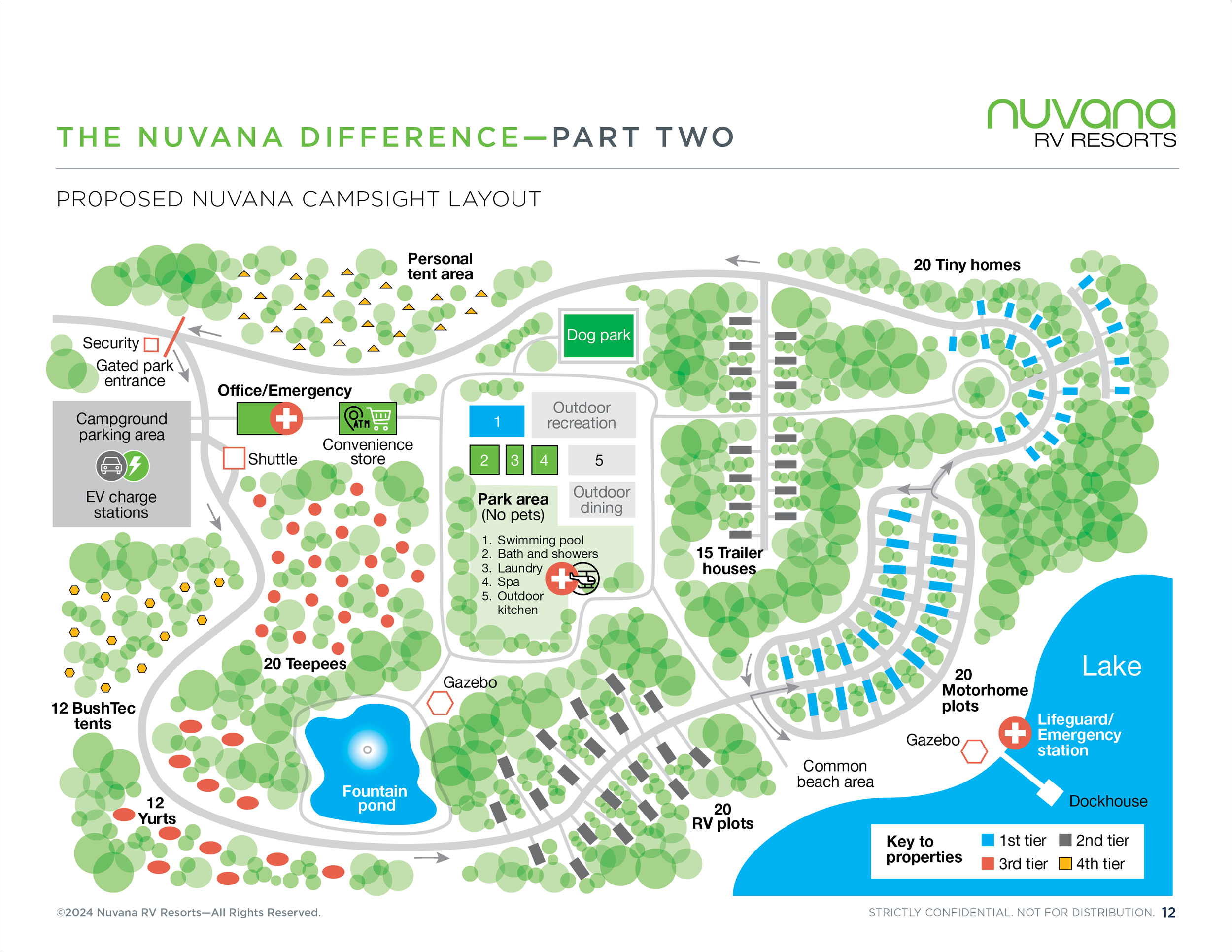
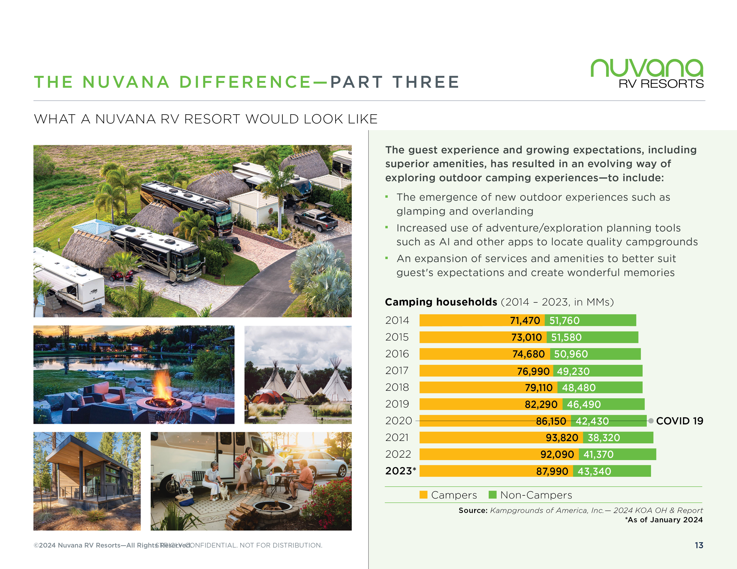
20 page, full investor presentation


12 page pitch book
Promotional one-sheets
Brand identity design experience


Retail marketing design and brand management
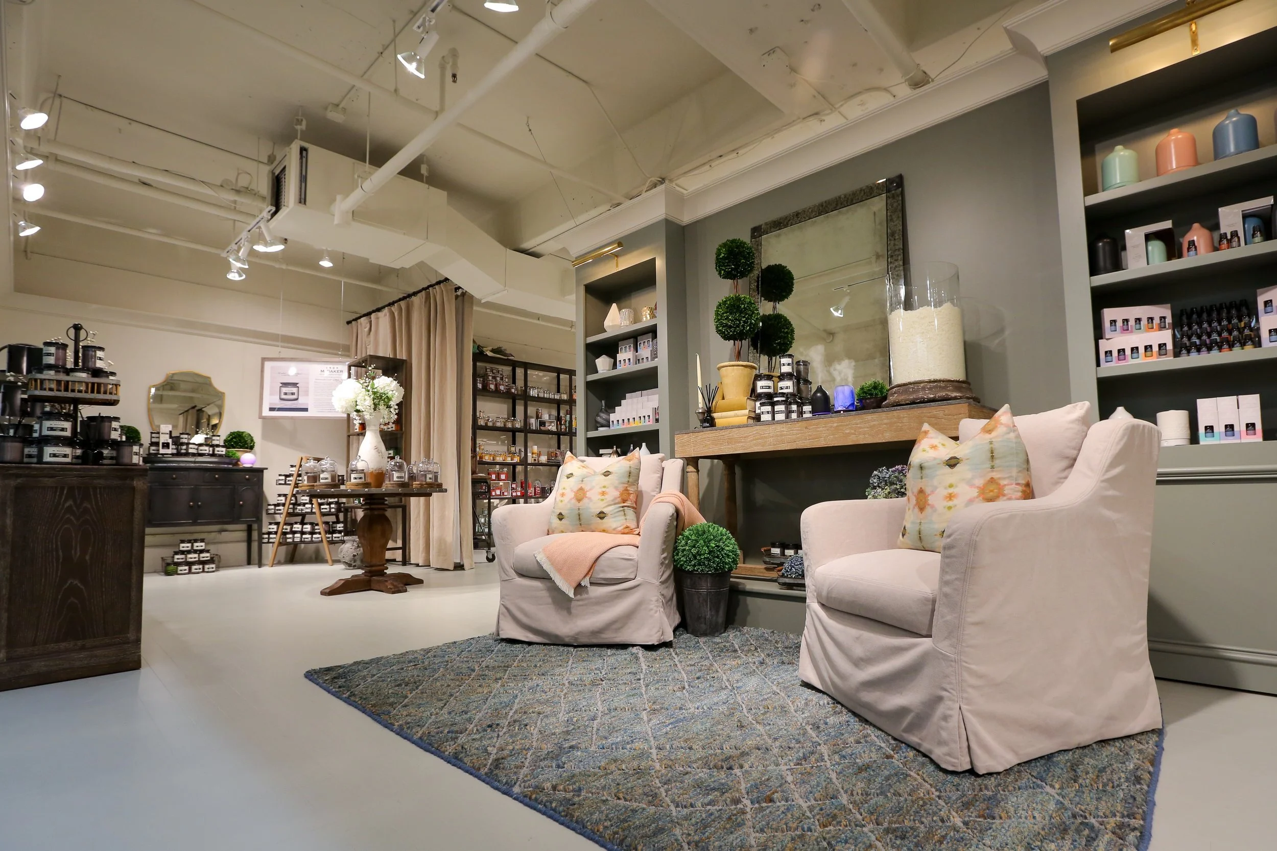
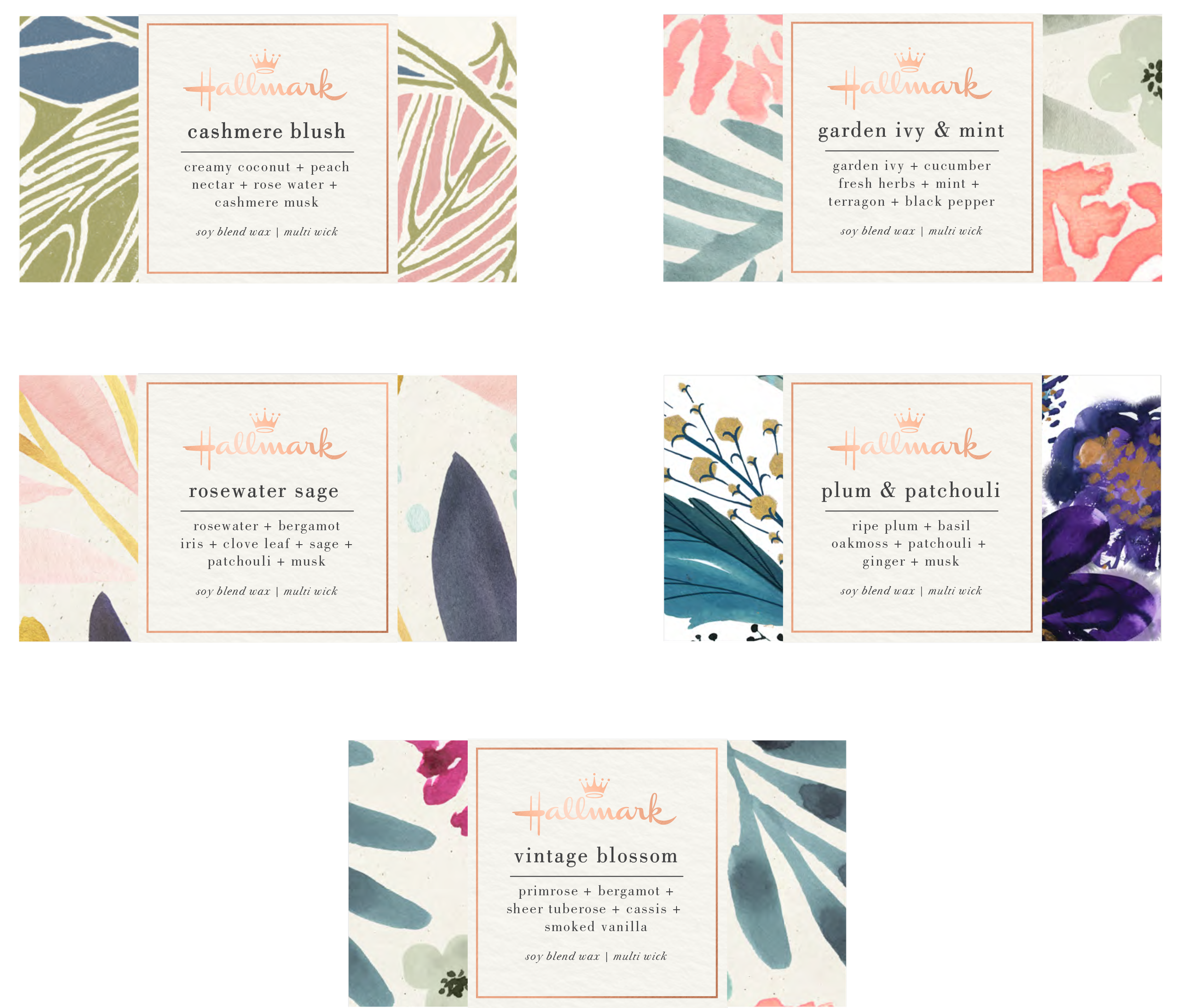
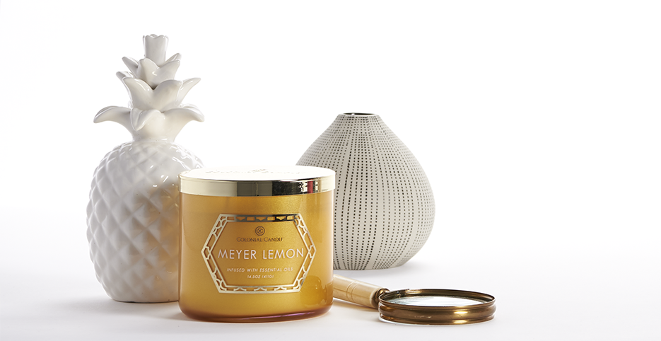
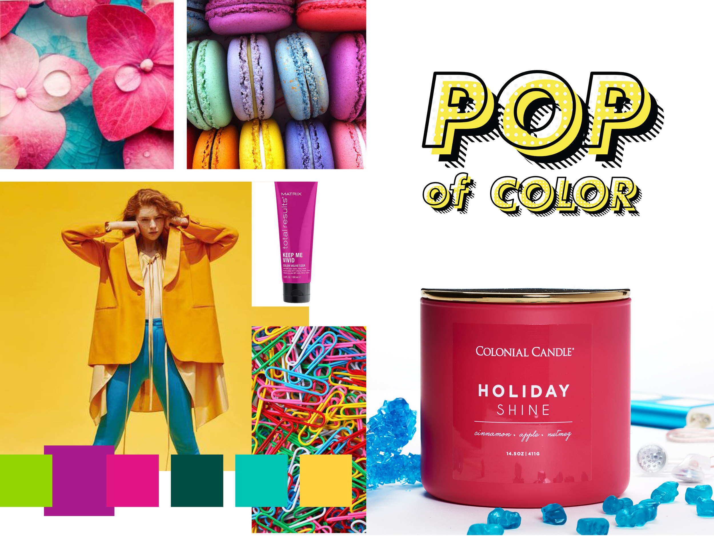
As Senior Brand Design Manager, I played an integral role in maintaining brand consistency and delivering creative across in-house and national accounts including Hallmark, Gaiam, Febreze, TJ Maxx, Target, Carolina Candles, POP of Color, M. Baker, and other leading brands. The work included in-store displays, mood and storyboards, advertising, trade show design, product and packaging design, and art direction for photography. I also co-managed DTC eCommerce operations on Shopify in-house.


Strategic, direct marketing for print
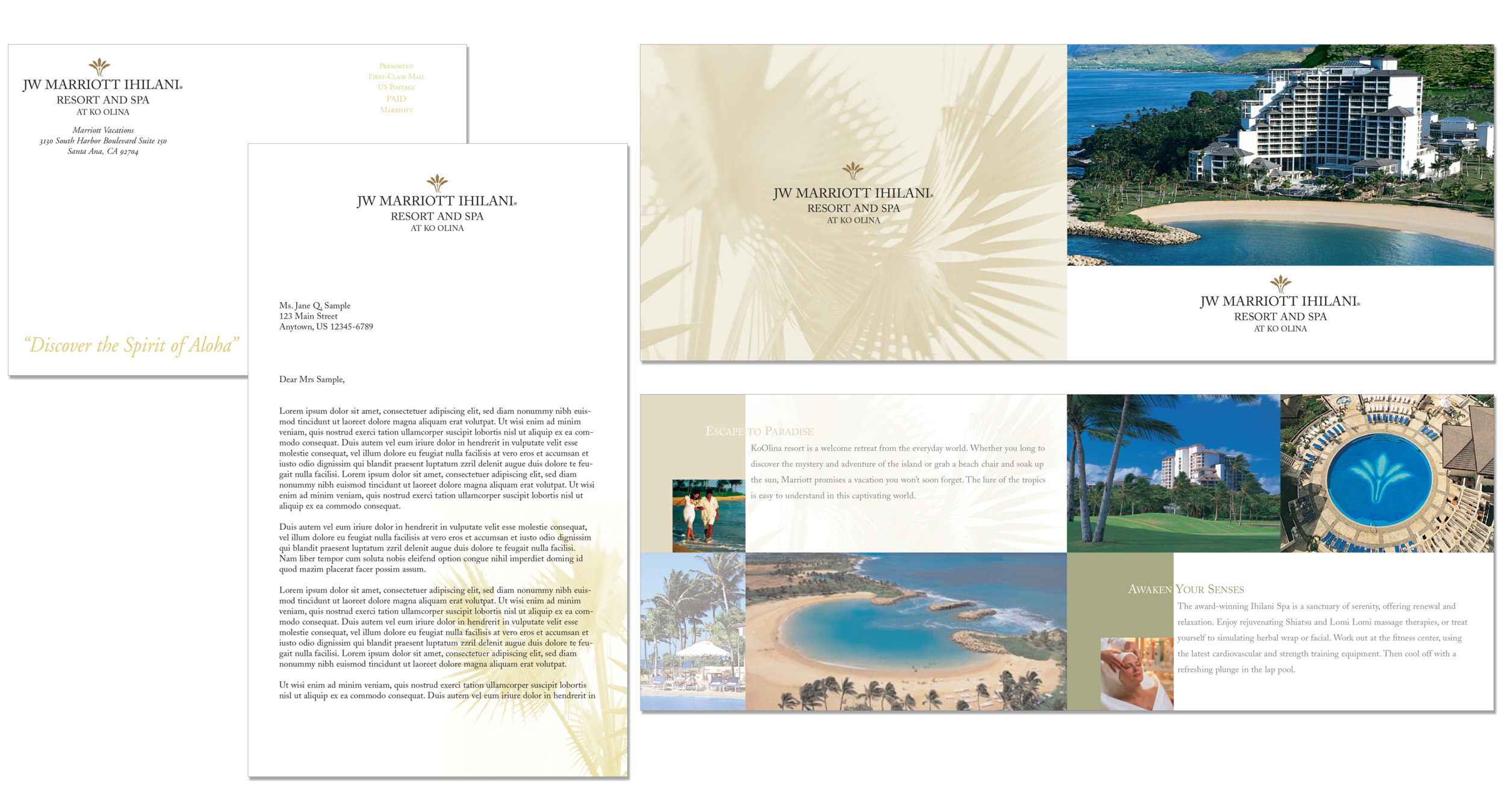
I have also created numerous direct marketing campaigns for:
Visa USA
Capital One Bank
American Red Cross
Muscular Dystrophy Association
Arthritis Foundation
Juvenile Diabetes Research Foundation
American Heart Association
AmSouth Bank
and others

Click on the MetLife logo to see the 2023 multi-channel direct marketing campaign I created.
Pharma and healthcare marketing communications
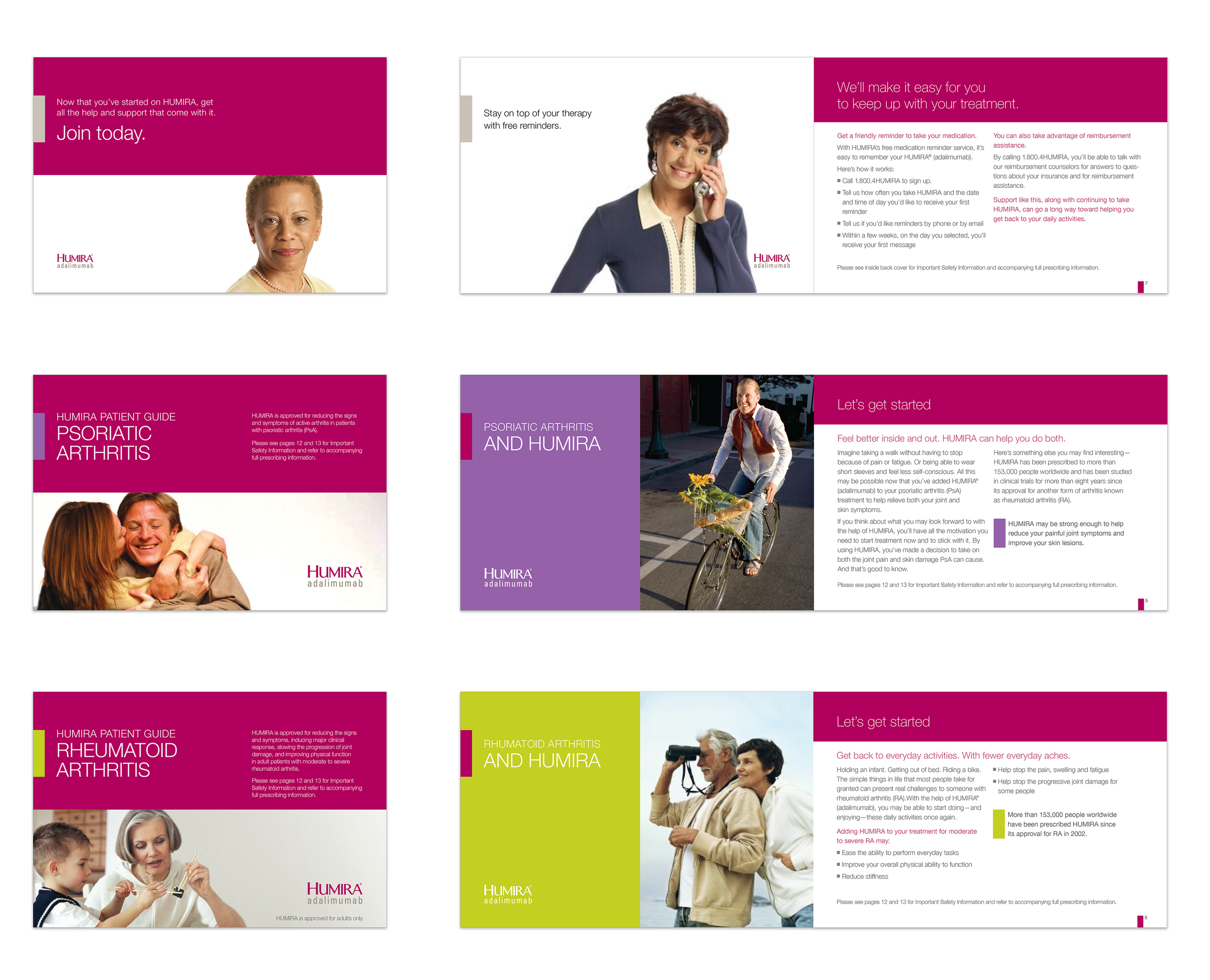

My work in pharma and healthcare includes:
Abbott Laboratories / Humira
Otsuka / Abilify
Yasmin
George Washington University Hospital
Loudoun Memorial Hospital
Awards won include:
Addy Award
Gold and Silver Ozzie’s
7 Print Industry of America Awards
On-air broadcast promotions
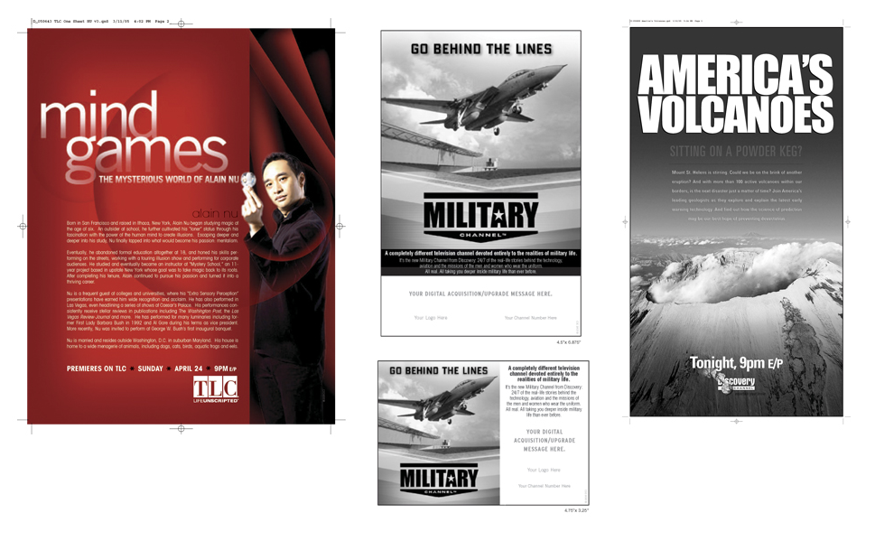
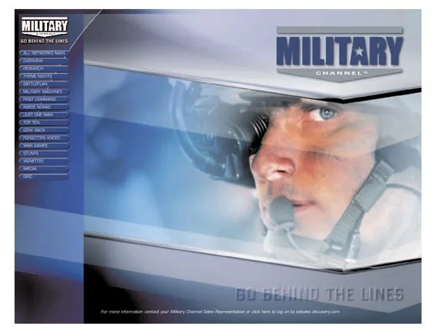
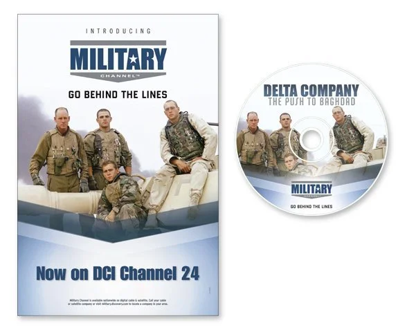
These are just a few of the many dozens of on-air promotions I had done while working with Discovery Communications. For the Military Channel, I designed the brand identity and drove the direction for all of the marketing material for this brand. It remained unchanged for just over a decade.

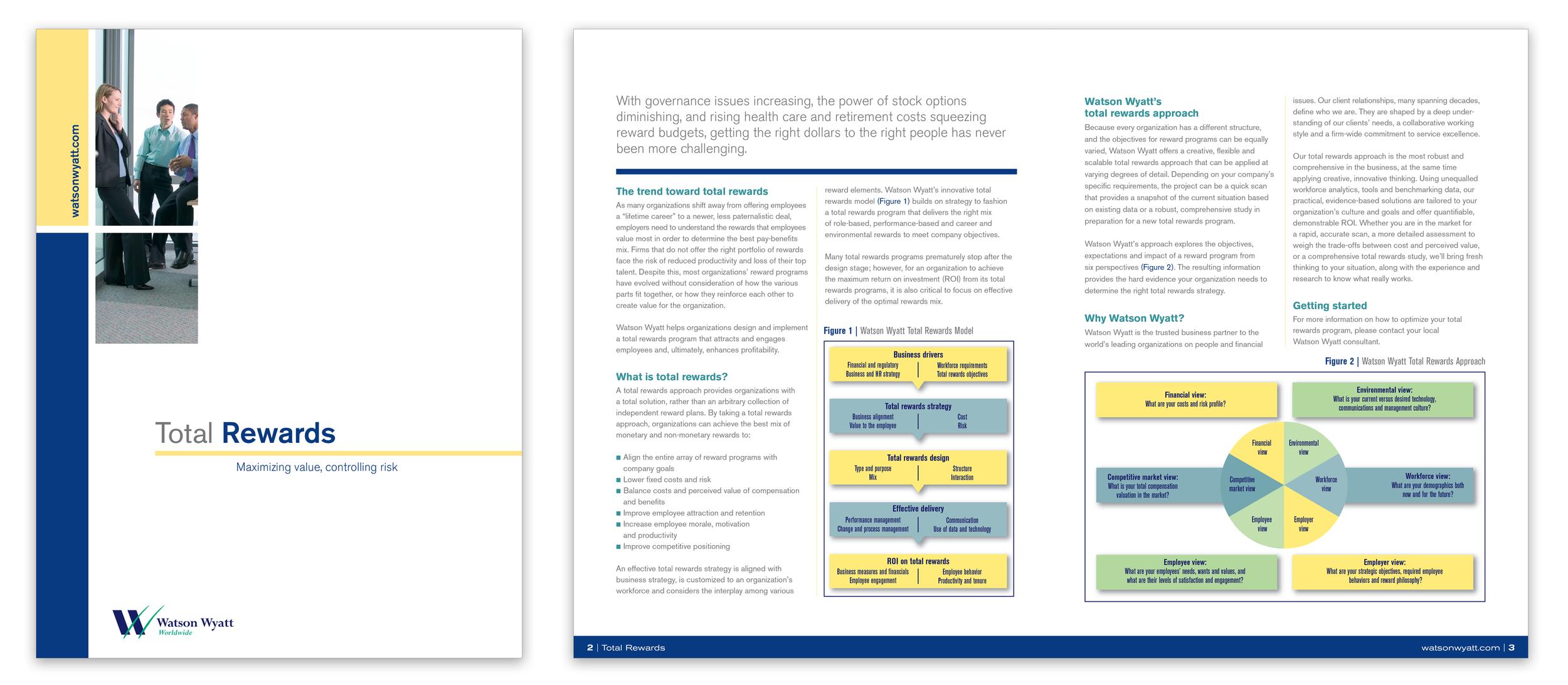
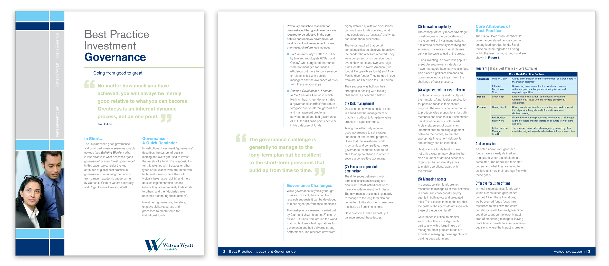
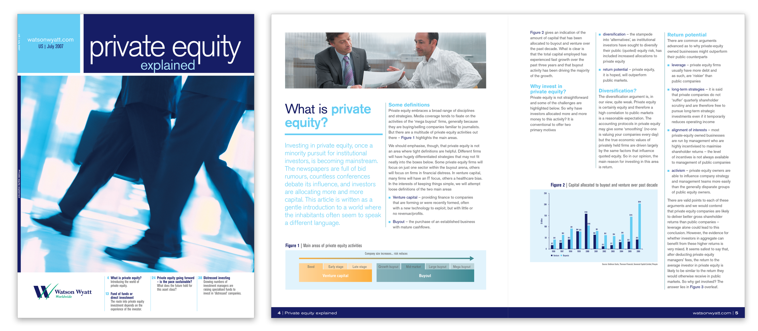
Corporate brand systems design
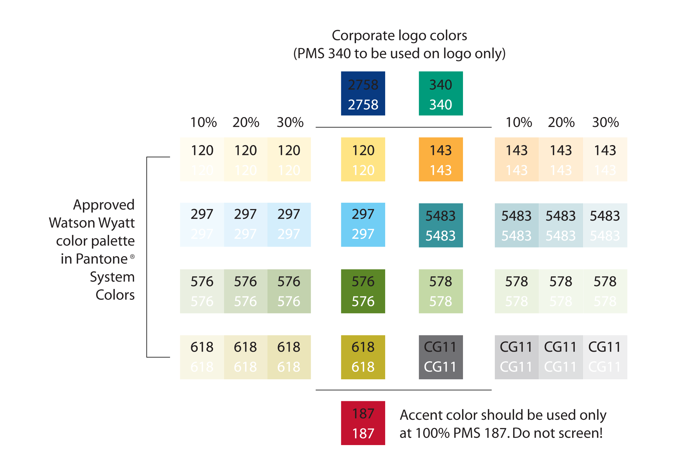
A successful brand system must be cohesive across every piece of communication. If it isn’t, the identity looks fragmented and gives the impression that the work came from outside resources unfamiliar with the brand.
I’ve built and overseen brand systems for companies across multiple industries, and I see them like a chorus—everyone singing from the same sheet of music. Each voice can be distinct, but together they create harmony. That’s how a brand system should work—every piece feels unified, even when the application changes.
Color, typography, imagery, and structure should always reinforce recognition. When used consistently, they make the brand unmistakable while still allowing for variation and creativity. That balance is what I focused on with Watson Wyatt and other clients at FMB+D—creating systems that made every campaign, brochure, and digital touchpoint look like part of the same story.

Data visualization—before and afters
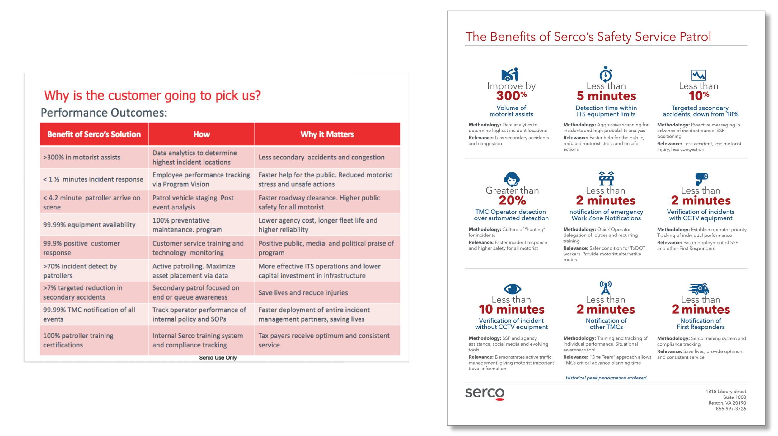
A client approached me with a data-heavy sales sheet built entirely in Excel. He couldn’t understand why the marketing materials weren’t landing any responses to his proposals. Everything was treated with equal weight. No hierarchy. No focus. The entire piece was laid out horizontally at 11 x 8.5 inches—sprawling and hard to digest.
I rewrote it and rebuilt it as a vertically structured diagram. The content remained the same, but the presentation changed. I established a clear visual hierarchy, moved the metrics to the top, and aligned the language around results. Once it launched, the client saw an immediate lift in response and engagement by 72% in three months.
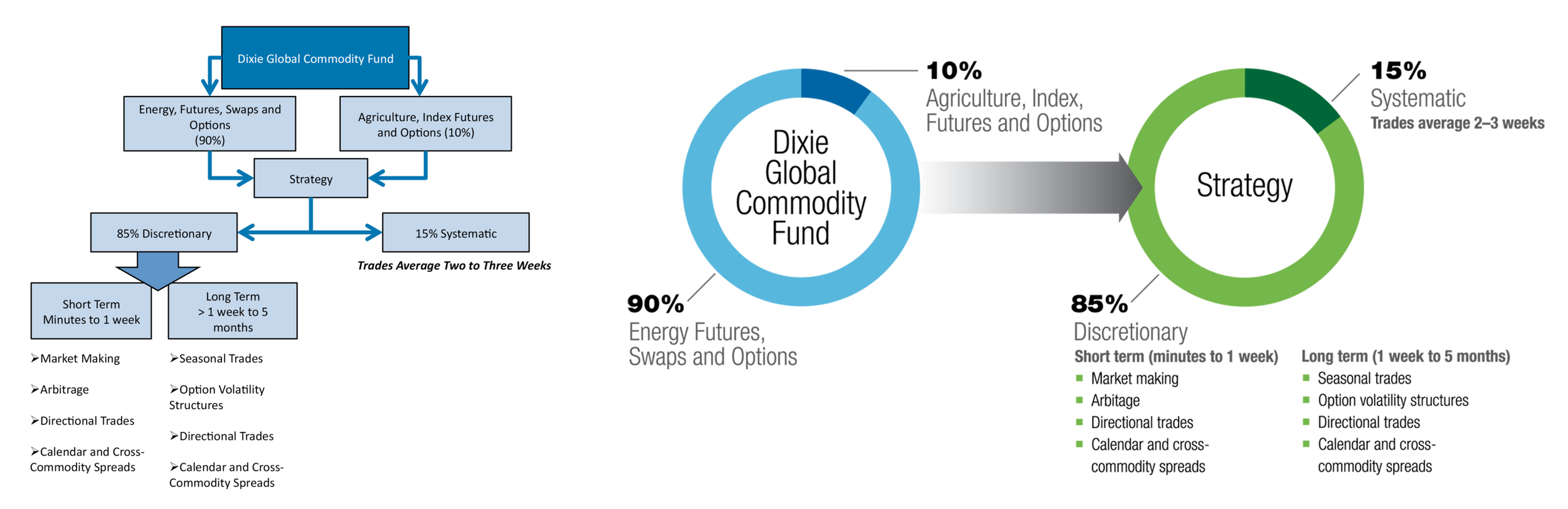
This was originally handed to me as a cluttered PowerPoint diagram with disconnected text and no visual logic. It was meant for their universal marketing and investor presentations but it failed to communicate the fund structure clearly.
I redesigned it as a single, structured diagram. The fund’s focus, allocation, and strategy were presented cleanly and in order. This final version was used throughout their marketing communications for digital and print.
“Fletcher’s reputation preceded him. I had heard about him in the D.C. area as being highly creative, producing thought-provoking and powerful material. I thought, surely, he might be a bit of an ego. Quite the contrary. I learned a lot working with him. ”
—JENNIFER ENGLAND, UI/UX/IAUI/IA/GODDESS